
Vertical line charting is a graphical method used in financial analysis, originating in Japan, which effectively represents trading patterns over a specific period. Each vertical line on the chart represents a trading session, plotting price movements against time. The top and bottom of each line show the highest and lowest prices for that session, respectively. This charting technique offers a comprehensive view of market activity, encompassing opening, closing, high, and low prices. It plays a pivotal role in understanding market trends and patterns, assisting in both short-term and long-term trading strategies. By consolidating crucial market data—highest, lowest, opening, and closing prices—in one line, vertical line charts offer a detailed, accessible view of market activity, making it an invaluable tool for financial analysis. At the heart of every vertical line chart lie price bars, each representing a specific trading session. A price bar consists of a vertical line and two horizontal 'ticks'. The vertical line indicates the range between the session's highest and lowest traded prices, while the ticks represent the opening and closing prices. The left tick denotes the opening price, and the right tick represents the closing price. These bars offer a compact, comprehensive view of a trading session's price action. In vertical line charting, volume represents the number of shares or contracts traded in a security or market during a given period. It is typically depicted as a bar graph at the bottom of the chart. High trading volumes can indicate strong investor interest and market activity, while low volumes may indicate a lack of interest or a "quiet" market. Volume is crucial in charting as it helps to validate price movements. A high volume generally suggests a more significant price move and vice versa. This correlation between price and volume can offer valuable insights into potential market trends. The time axis in vertical line charting represents the period selected for analysis. This can range from minutes to years, depending on the trader's strategy and goals. The choice of timeframe can significantly influence the interpretation of the chart. Shorter time frames can be used for intraday trading strategies, while longer timeframes are typically used for long-term investment strategies. The time axis allows traders to view price movements within their chosen trading period, providing the necessary context for informed decision-making. The first step in creating a vertical line chart is gathering the necessary financial data. This includes the opening, closing, high, and low prices for the desired timeframe. This data can usually be obtained from financial news websites, stock exchanges, or online trading platforms. The next step involves choosing the timeframe for your analysis. The timeframe should align with your trading or investment strategy. For instance, day traders might opt for a minute-by-minute or hourly chart, while long-term investors might prefer daily, weekly, or monthly charts. After collecting the necessary data and choosing a timeframe, you can begin plotting the price and volume data on your chart. Each trading session is represented by a single vertical line, with horizontal ticks showing the opening and closing prices. The volume is typically represented as a bar graph at the bottom of the chart. The final step in creating a vertical line chart is learning how to interpret it effectively. By analyzing the patterns in the price bars and volume data, traders can make informed predictions about future price movements. Understanding how to interpret a vertical line chart can take time and practice. It involves not only identifying common chart patterns but also understanding the broader context of the market. The more familiar you become with these charts, the more effectively you can use them to inform your trading decisions. While both vertical line and candlestick charting are graphical representations of price movements, they vary in detail and interpretation. Candlestick charts include a 'body' which demonstrates the range between opening and closing prices, whereas vertical line charts only employ lines and ticks to represent this data. Candlestick charting may provide more visually intuitive trading signals than vertical line charts, given its color-coded representation of bullish or bearish sessions. However, vertical line charts can offer a clearer depiction of price ranges without the complexity of color and body lengths, potentially making them easier for beginners to understand. Both vertical line and bar charts provide the same information: open, high, low, and closing prices. The difference lies in their visualization. A bar chart uses a horizontal line to indicate the opening and closing prices, which can sometimes make it harder to distinguish these prices compared to a vertical line chart's clear left and right ticks. Line charts represent the most simplistic form of charting, showing only the closing prices connected by a continuous line. While line charts offer a clean and straightforward visualization of price trends, they lack the detailed price information found in vertical line charts, such as opening, high, and low prices. For traders seeking a deeper understanding of market behavior, vertical line charts are preferable. Vertical line charting consolidates detailed price and volume information into an easily digestible format. Its design allows traders to quickly identify price ranges and trends without the additional visual elements of other chart types. Moreover, the inclusion of volume data can offer further insights into the strength of price movements, an element that's often missing from other chart types. Vertical line charts are particularly valuable in stock analysis. By plotting the daily open, high, low, and close prices, these charts can provide a comprehensive snapshot of a stock's performance over time. This detailed view can help traders identify potential buy and sell signals, support and resistance levels, and overall price trends. In the fast-paced Forex market, vertical line charts can be a crucial tool for tracking currency pair fluctuations. Traders can analyze price trends and make informed predictions about future movements, potentially increasingg their chances of executing successful trades. By providing a detailed view of the market, vertical line charts can assist in timing trades more accurately and mitigating risk. In commodity markets, vertical line charting can be used to track the prices of various commodities like oil, gold, and agricultural products. The inclusion of volume data can also help traders to gauge market interest and the potential impact of supply and demand on price trends. With the rise of digital assets, vertical line charting has found a new application in cryptocurrency markets. Given the highly volatile nature of cryptocurrencies, these charts can provide critical insights into price trends and patterns, helping traders to navigate these dynamic markets effectively. Trendlines can be a valuable addition to vertical line charts, helping to highlight the overall direction of price movements. Similarly, identifying support and resistance levels can provide insight into potential price boundaries and reversal points. Vertical line charting can be combined with other technical analysis tools for a more comprehensive analysis. Indicators such as moving averages, relative strength index (RSI), or Bollinger Bands can be added to vertical line charts to provide additional context and improve prediction accuracy. Pattern recognition is a critical aspect of technical analysis. With their detailed depiction of price movements, vertical line charts can help traders to spot various chart patterns such as head and shoulders, double tops and bottoms, and triangles. Recognizing these patterns can aid in predicting future price movements. Vertical line charts can be incorporated into various trading strategies. For example, swing traders might use these charts to identify price swings and reversals, while momentum traders could use them to spot increasing volume accompanying significant price moves. As with any technical analysis tool, vertical line charting is not foolproof. Charts merely represent historical data, and while they can provide useful insights, they cannot guarantee future outcomes. Traders should be wary of relying solely on chart analysis and consider incorporating fundamental analysis or other trading tools into their strategy. Market volatility can significantly impact the interpretation of vertical line charts. In highly volatile markets, drastic price swings can lead to a cluttered and confusing chart, potentially making trend identification challenging. Traders should be mindful of market volatility and consider adjusting their timeframe or incorporating additional tools to aid in their analysis. While vertical line charts provide a wealth of information, they can sometimes be overwhelming for beginners. The multitude of price bars and volume data can make the chart seem cluttered and difficult to interpret. However, with practice and the use of additional tools like trendlines or technical indicators, traders can enhance their understanding and use of vertical line charts. Moreover, vertical line charts, like other technical analysis tools, are based on historical data and cannot predict future price movements with absolute certainty. They should be used as part of a broader trading strategy rather than a standalone predictive tool. Vertical line charting is a key financial analysis tool, offering a comprehensive and clear view of trading patterns. It uses price bars and volume data to deliver in-depth insights into market activity, aiding informed decision-making. Creating such a chart involves gathering financial data, setting an appropriate timeframe, plotting price and volume data, and interpreting the chart. The technique is widely applicable across various financial markets, including stocks, Forex, commodities, and cryptocurrencies. Combining vertical line charting with other technical analysis tools, such as trendlines and pattern recognition, can significantly enhance its utility. However, users should be aware of its limitations, including potential pitfalls and the influence of market volatility. For those new to vertical line charting, consulting with professional financial advisors can be beneficial, as they can offer expert guidance, personalized strategies, and help in achieving investment goals.What Is Vertical Line Charting?
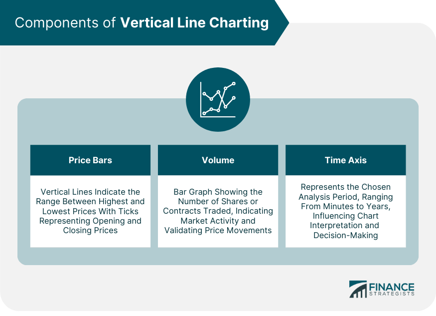
Components of Vertical Line Charting
Price Bars
Volume
Time Axis
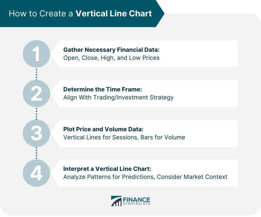
How to Create a Vertical Line Chart
Gather Necessary Financial Data
Determine the Time Frame
Plot Price and Volume Data
Interpret a Vertical Line Chart
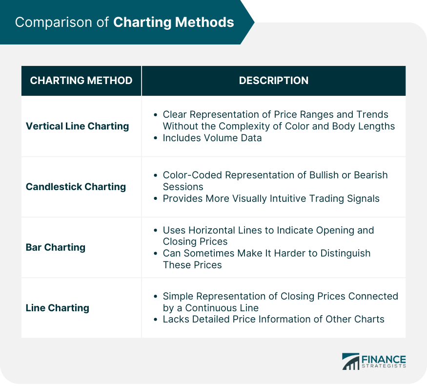
Vertical Line Charting vs Other Charting Methods
Comparing Vertical Line Charting and Candlestick Charting
Vertical Line Charting vs Bar Charting
Vertical Line Charting vs Line Charting
Unique Advantages of Vertical Line Charting
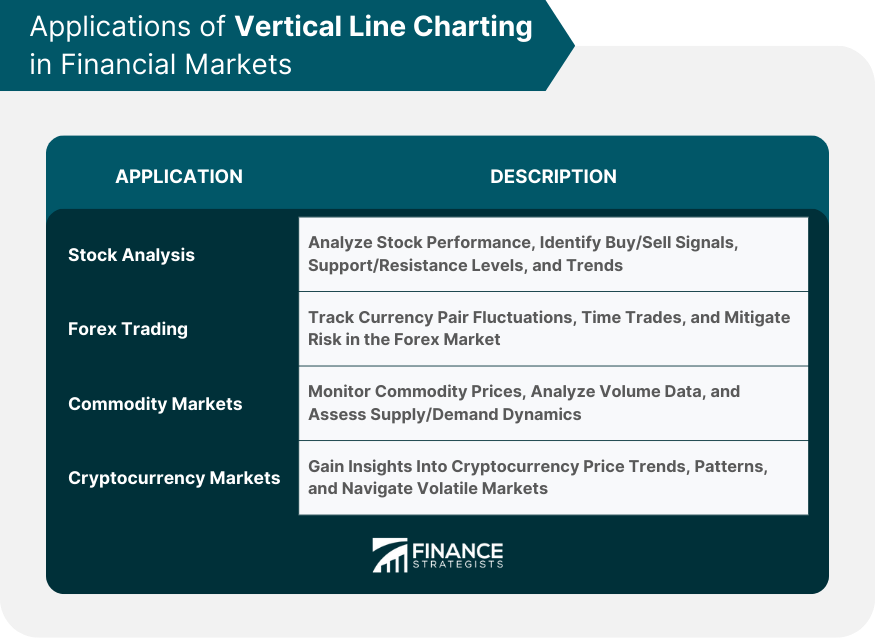
Practical Applications of Vertical Line Charting in Financial Markets
Stock Analysis
Forex Trading
Commodity Markets
Cryptocurrency Markets
Advanced Techniques in Vertical Line Charting
Incorporating Trendlines and Support/Resistance Levels
Combining Vertical Line Charting with Other Technical Analysis Tools
Using Vertical Line Charting for Pattern Recognition
Vertical Line Charting and Trading Strategies
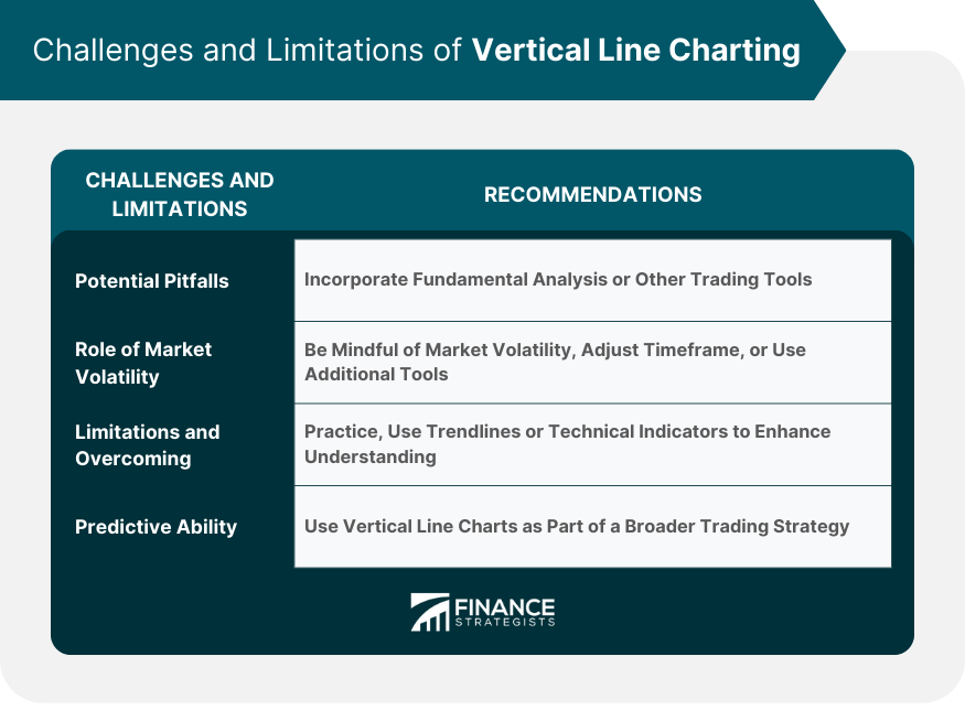
Challenges and Limitations of Vertical Line Charting
Potential Pitfalls in Using Vertical Line Charting
Role of Market Volatility in Vertical Line Charting
Limitations of Vertical Line Charting and How to Overcome Them
Final Thoughts
Vertical Line Charting FAQs
Vertical line charting is a method used in financial analysis to illustrate the price movements of a security over a given period. It provides detailed information, including opening, closing, high, and low prices for each trading session.
Unlike other methods like line charting or bar charting, vertical line charting provides more detailed price information. It uses a unique combination of vertical lines and horizontal 'ticks' to represent the range and opening/closing prices of a trading session, respectively.
Volume, which represents the number of shares or contracts traded in a given period, is crucial in validating price movements. High volume generally indicates a significant price move, offering valuable insights into potential market trends.
Vertical line charting can be used in various financial markets,] including stock, forex, commodity, and cryptocurrency markets. It helps traders identify potential buy and sell signals, support and resistance levels, and overall price trends.
While vertical line charts provide a wealth of information, they can be overwhelming for beginners due to the detailed representation of price and volume data. Additionally, like other charting methods, they rely on historical data, which cannot predict future price movements with absolute certainty.
True Tamplin is a published author, public speaker, CEO of UpDigital, and founder of Finance Strategists.
True is a Certified Educator in Personal Finance (CEPF®), author of The Handy Financial Ratios Guide, a member of the Society for Advancing Business Editing and Writing, contributes to his financial education site, Finance Strategists, and has spoken to various financial communities such as the CFA Institute, as well as university students like his Alma mater, Biola University, where he received a bachelor of science in business and data analytics.
To learn more about True, visit his personal website or view his author profiles on Amazon, Nasdaq and Forbes.