
An OHLC chart, short for open-high-low-close chart, is a type of chart used predominantly in financial trading. These charts are utilized to illustrate movements in the price of a financial instrument over time. Each vertical line on the chart shows the price range (the highest and lowest prices) over one unit of time, such as an hour, a day, or a week. In this chart, four critical points of data are displayed for each time unit: the opening price, the highest price, the lowest price, and the closing price. In finance, the ability to visually analyze and interpret price movements and market trends is crucial. Charting provides traders with a visual representation of a series of price movements over a specific period, enabling traders to view patterns that can inform their investment decisions. OHLC charts, in particular, offer more detailed information than many other chart types, providing insights into the volatility and trends within each time period. The open price is the price at which a financial instrument starts trading when the exchange opens for a specific period—like the beginning of the day for daily charts. The high price is the maximum price at which the financial instrument traded during the given period. This data point is essential as it gives traders an idea about the strength of the buying activity during that period. In contrast, the low price is the minimum price at which the financial instrument traded during the same period. This information reveals the selling pressure during the given time frame. The closing price is the final price at which the financial instrument trades during the period before the market closes. This is often considered the most significant price because it determines the net change for the period and sets the price level for the start of the next period. The first step in creating an OHLC chart is collecting the relevant data. This involves gathering the opening, high, low, and closing prices for the financial instrument over the period you are interested in. This data can often be found on financial news websites, directly from exchanges, or via online trading platforms. Once you have the necessary data, you can use various software tools to create your OHLC chart. Many online trading platforms have built-in features for generating OHLC charts. Additionally, spreadsheet programs like Microsoft Excel or Google Sheets can be used to create custom OHLC charts. Some specialized software packages and programming languages, like Python with its libraries pandas and matplotlib, are also popular choices for more advanced charting and analysis. OHLC charts can be represented in two major formats: the bar chart format and the candlestick format. Both formats provide the same data but in slightly different visual representations. In the bar chart format, a vertical line is used to represent the high and low prices, while horizontal lines on either side of the vertical line represent the opening and closing prices. The candlestick format provides a more visually impactful representation. The "body" of the candlestick represents the range between the opening and closing prices, and the "wick" or "shadow" shows the range of the high and low prices. The body is filled (colored) if the market closed lower than it opened (a down period) and hollow (uncolored) or filled with a different color if the market closed higher than it opened (an up period). Understanding the timeframe of an OHLC chart is crucial for accurate interpretation. The timeframe refers to the period that each bar or candlestick represents. For example, in a daily OHLC chart, each bar represents one trading day's worth of data. Alternatively, in a 1-hour chart, each bar represents one hour of trading data. The choice of timeframe often depends on the trader's strategy. Day traders might prefer shorter timeframes like 1-minute or 5-minute charts, while longer-term investors might look at daily, weekly, or even monthly charts. Analyzing price movements and trends is a crucial part of using OHLC charts. A trend is the general direction in which the price of an asset is moving. In an uptrend, the price of the asset tends to make higher highs and higher lows. Conversely, in a downtrend, the asset's price tends to make lower highs and lower lows. In an OHLC chart, traders can identify these trends by analyzing the sequence of bars or candlesticks. For example, a series of bars with higher highs and higher lows could suggest an uptrend, while a series of bars with lower highs and lower lows could suggest a downtrend. OHLC charts are fundamental in technical analysis for identifying market trends. By observing the patterns formed by the opening, closing, high, and low prices, traders can determine whether an asset's price is generally trending upward, downward, or sideways. This information is vital for decision-making in trading and investing. OHLC charts are also used to detect specific price patterns, which are recurrent themes or movements in the market that can suggest future price behavior. Examples of such patterns include the "head and shoulders" and "double top" patterns, which typically signal a potential market reversal. By recognizing these patterns on an OHLC chart, traders can make more informed predictions about future price movements. OHLC chart data is commonly used in calculating various technical indicators, which are mathematical calculations based on price and volume data. These indicators, such as moving averages, Bollinger Bands, and the Relative Strength Index (RSI), provide additional insights into market conditions and potential price trends. By overlaying these indicators on an OHLC chart, traders can enhance their market analysis. Intraday trading involves buying and selling financial instruments within the same trading day. In this context, OHLC charts can be particularly useful, especially with shorter time frames like 1-minute or 5-minute charts. These charts can help traders identify short-term price trends and make quick decisions. Swing trading is a strategy that attempts to capture gains in a financial instrument over a period of a few days to several weeks. OHLC charts, especially daily and hourly charts, are essential tools for swing traders. They help identify potential entry and exit points based on price trends and patterns. For long-term investing, weekly or monthly OHLC charts can be beneficial. They provide a broader view of the market and help investors understand long-term price trends and patterns. This can aid in making strategic investment decisions, such as deciding when to buy or sell an asset based on long-term trends rather than short-term market fluctuations. While OHLC charts provide a wealth of information, they cannot capture every aspect of market behavior. One such limitation is their inability to fully represent intraperiod volatility. That is, the high and low prices within a given period provide only a snapshot of price extremes, and the sequences of these price changes are not reflected. Therefore, sudden price movements within the period may not be adequately represented on an OHLC chart. OHLC charts are part of technical analysis, which focuses on price and volume data. However, they do not provide information about market fundamentals, such as economic indicators, corporate earnings reports, or changes in monetary policy, which can have substantial impacts on market prices. Thus, while technical analysis with OHLC charts can be a powerful tool, it is often beneficial to consider fundamental analysis to get a comprehensive view of the market. Because of these limitations, it's crucial to use OHLC charts in conjunction with other analysis methods. Other chart types, technical indicators, fundamental analysis, and macroeconomic data can all provide additional insights and help you make more informed trading decisions. A line chart is a simple and common type of chart used in various fields, including finance. It plots a series of data points connected by a straight line. In the context of financial trading, line charts usually represent closing prices over time. Compared to OHLC charts, line charts are less detailed as they only provide one data point (closing price), thus potentially missing valuable information about price volatility within each period. Point and Figure charts are unique as they focus solely on price changes, disregarding time and volume. These charts use a series of X's and O's to represent rising and falling prices respectively. The main advantage of Point and Figure charts is their focus on significant price moves, ignoring minor price fluctuations. However, the lack of time and volume data makes them less comprehensive compared to OHLC charts. Candlestick charts, like OHLC charts, represent open, high, low, and close prices over time. The main difference lies in their visual presentation. Candlestick charts use rectangular "bodies" to show the range between opening and closing prices and thin "wicks" for the high and low prices. Candlestick charts are often favored for their visual impact, making it easy to see the relationship between opening and closing prices and the price range in a given period. In comparison to line charts and Point and Figure charts, OHLC charts provide a more comprehensive view of price action within a specific period. OHLC and Candlestick charts have comparable levels of detail but offer different visual representations. The choice between these chart types often comes down to personal preference and ease of interpretation. OHLC charts provide detailed information about the opening, high, low, and closing prices of a financial instrument over a specific time period. OHLC charts can be represented in different formats, such as bar charts or candlestick charts, each offering its own visual representation of price data. It is important to understand the timeframe of an OHLC chart and choose the appropriate one based on the trading or investing strategy. Traders can analyze price movements and trends by examining the sequence of bars or candlesticks, enabling them to identify potential market reversals or favorable entry and exit points. Additionally, OHLC charts can be used in conjunction with technical indicators and other analysis methods to enhance market analysis. While OHLC charts have their limitations, such as their inability to capture intraperiod volatility comprehensively and the exclusion of fundamental factors, they can still provide valuable insights when combined with complementary analysis methods. It is essential for traders and investors to consider other chart types, fundamental analysis, and macroeconomic data to gain a comprehensive understanding of the market. What Is the OHLC Chart?
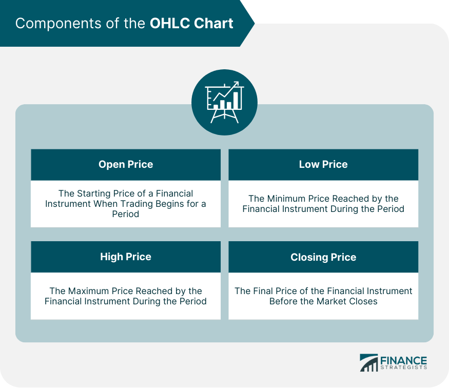
Components of the OHLC Chart
Open Price
High Price
Low Price
Closing Price
Creating an OHLC Chart
Collection of Relevant Data
Using Software Tools for Chart Creation
Reading and Interpreting the OHLC Chart
Significance of the Candlestick and Bar Chart Formats
Understanding Chart Timeframes
Analyzing Price Movements and Trends
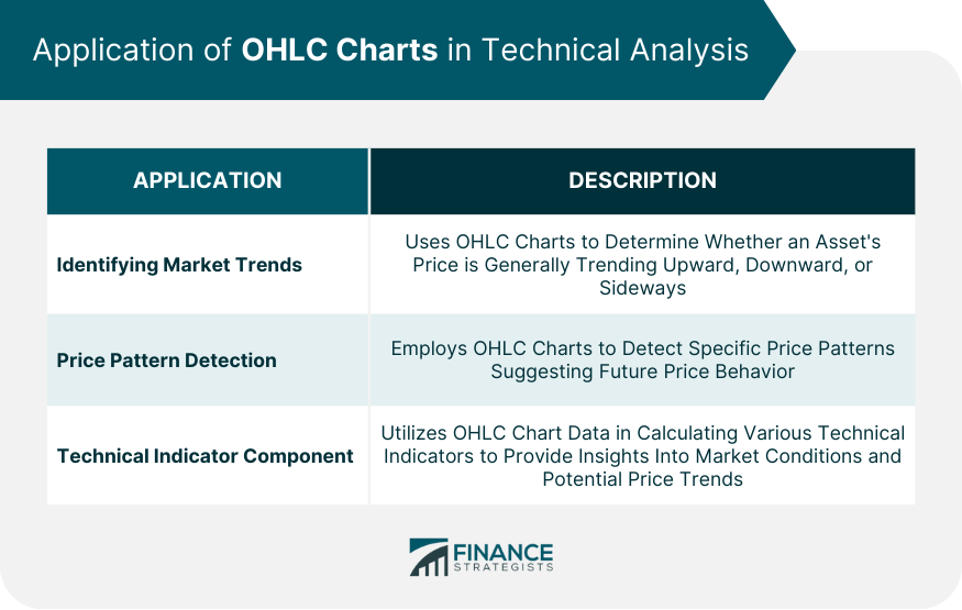
Application of OHLC Charts in Technical Analysis
Identifying Market Trends
Price Pattern Detection
Technical Indicator Component
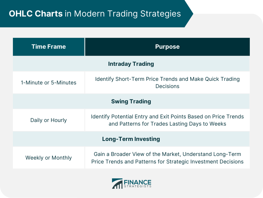
OHLC Charts in Modern Trading Strategies
Intraday Trading
Swing Trading
Long-Term Investing
Limitations and Caveats of OHLC Charts
Understanding Market Volatility
Role of Market Fundamentals
Importance of Complementary Analysis Methods
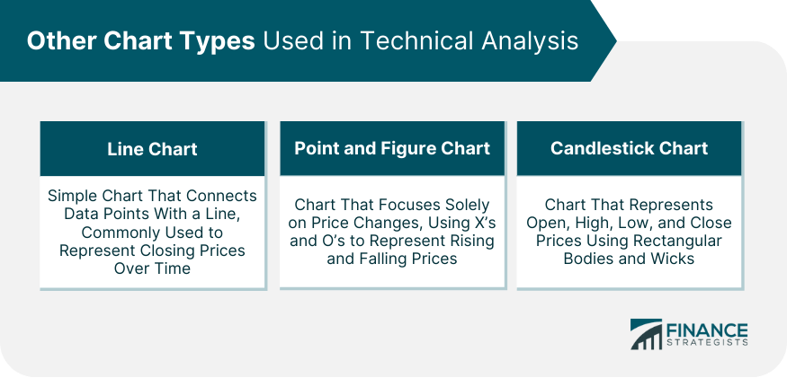
Other Chart Types Used in Technical Analysis
Line Chart
Point and Figure Chart
Candlestick Chart
Comparison With OHLC
Final Thoughts
OHLC Chart FAQs
While both OHLC and candlestick charts represent the open, high, low, and close prices, they differ in their visual representation. OHLC charts use vertical lines with horizontal lines on either side to denote the opening and closing prices, while candlestick charts use rectangular bodies and thin wicks to represent the price range. Candlestick charts are often favored for their visual impact and ease of interpreting price patterns.
OHLC charts are instrumental in identifying market trends. By analyzing the sequence of bars or candlesticks, traders can determine if an asset's price is trending upward (uptrend), downward (downtrend), or moving sideways. A series of higher highs and higher lows suggests an uptrend, while lower highs and lower lows indicate a downtrend.
Yes, OHLC charts can be valuable for short-term trading. Traders who engage in intraday trading can use OHLC charts with shorter timeframes, such as 1-minute or 5-minute charts, to identify short-term price trends and make quick trading decisions.
One limitation of OHLC charts is their inability to capture intraperiod volatility comprehensively. They provide a snapshot of the high and low prices within a period, potentially overlooking sudden price movements within that timeframe. Additionally, OHLC charts solely rely on price and volume data, omitting fundamental factors that can influence market prices.
OHLC charts can be beneficial for long-term investing by providing a broader view of the market and understanding long-term price trends. Weekly or monthly OHLC charts can help investors make strategic investment decisions based on long-term trends rather than short-term market fluctuations. These charts offer insights into price patterns and can aid in identifying favorable entry or exit points for long-term investments.
True Tamplin is a published author, public speaker, CEO of UpDigital, and founder of Finance Strategists.
True is a Certified Educator in Personal Finance (CEPF®), author of The Handy Financial Ratios Guide, a member of the Society for Advancing Business Editing and Writing, contributes to his financial education site, Finance Strategists, and has spoken to various financial communities such as the CFA Institute, as well as university students like his Alma mater, Biola University, where he received a bachelor of science in business and data analytics.
To learn more about True, visit his personal website or view his author profiles on Amazon, Nasdaq and Forbes.