
A histogram is a graphical representation of data grouped into user-defined ranges or bins. This practical visualization tool condenses a data series into a visually digestible form. It takes a multitude of data points and categorizes them into logical ranges, effectively providing a macroscopic view of the dataset. Unlike bar graphs which typically display categorical data, histograms are designed for numerical or quantitative data. In the realm of financial analysis, histograms are especially useful in visualizing and interpreting large amounts of data. They are capable of demonstrating patterns, identifying outliers, and showing data skewness that could be overlooked in raw data reviews. Thus, histograms serve as a handy tool in the hands of financial analysts who routinely deal with extensive and complex financial data. In a histogram, the horizontal axis (X-axis) represents the data categories or bins into which the data points are grouped. These categories are usually numerical ranges that encompass the overall data. The vertical axis (Y-axis), on the other hand, signifies the frequency of data points falling into each category or bin. The height of each bar corresponds to the frequency or the percentage of total observations that fall into each bin. Four main characteristics stand out in the analysis of a histogram: shape, center, spread, and outliers. The shape of a histogram provides essential insights into the nature of the data distribution. This shape could be symmetrical, skewed right, skewed left, unimodal (having one peak), bimodal (having two peaks), or multimodal (having multiple peaks). In a symmetrical histogram, the left and right sides are mirror images of each other. This type of distribution suggests that the data points are evenly distributed around the mean. One common type of symmetrical distribution is a normal (bell-shaped) distribution. In a skewed histogram, the data points tend to lean more to one side. If the histogram leans towards the left, it is positively skewed, indicating that the data has a longer tail on the right. Conversely, if it leans towards the right, it is negatively skewed, meaning there's a longer tail on the left. Unimodal histograms have a single prominent peak, which represents the most frequent observation. Bimodal histograms, on the other hand, have two distinct peaks, indicating two frequent observations, and multimodal histograms display multiple peaks. The center of a histogram refers to the median of the data set. It's the point that divides the data into two equal halves. In a symmetric distribution, the median and the mean (average) are the same. However, in a skewed distribution, the mean and median will differ, with the mean being pulled in the direction of the skew. Analyzing the center is critical to understanding the 'typical' value you might expect from your data. The spread or dispersion in a histogram refers to the range of the data or how widely the data is distributed. It includes considerations such as the range (the difference between the highest and lowest data point), the interquartile range (the range of the middle 50% of the data), and the standard deviation (a measure of how much the data tends to deviate from the mean). Outliers are data points that deviate significantly from the other observations. They may suggest variability in the data, experimental error, or a novel phenomenon. Outliers can often be easily spotted in a histogram as bars that are noticeably distant from others. Histograms hold significant value in the financial industry. They provide a visual representation of data that assists financial analysts in identifying patterns, trends, and distribution characteristics in financial datasets. Analysts often use histograms to visualize distributions of returns, understand their skewness and kurtosis, and assess their volatility. One notable example of histograms in financial data representation is the analysis of stock returns. An analyst may use a histogram to visualize and understand the distribution of daily or monthly returns of a specific stock. The histogram can show if the returns are normally distributed or if they lean towards positive or negative returns. In portfolio management, histograms can be used to depict the distribution of portfolio returns and thereby assist in risk assessment. Similarly, in loan portfolio management, a histogram can be used to understand the distribution of default probabilities, which can guide risk management strategies. Reading a histogram involves understanding its structure and what each axis represents. The range of data on the X-axis and the frequency of occurrences on the Y-axis combine to form various bars or columns. The size of these columns and their spread across the chart provides a visual picture of the data’s distribution. The shape of a histogram is a significant characteristic. A symmetric histogram indicates a normal distribution. On the other hand, a skew to the right (positively skewed) suggests that the data has many smaller values and fewer larger values. Conversely, a skew to the left (negatively skewed) indicates many larger values and fewer smaller ones. The spread of a histogram refers to the extent of the distribution of data. A wider spread signifies a large range of data values, and a narrow spread indicates a small range of data values. This spread can give insight into the data’s variability. Skewness and kurtosis are two statistical properties that can be identified in a histogram. Skewness refers to the asymmetry of the data distribution around the mean. Positive skewness indicates a longer or fatter tail to the right side, whereas negative skewness shows a longer tail to the left. Kurtosis, on the other hand, pertains to the "tailedness" of the distribution. A histogram with high kurtosis tends to have a distinct peak and fat tails, while a histogram with low kurtosis tends to have a flat top and thin tails. In financial analysis, understanding skewness and kurtosis can be crucial as they can influence the risk and return trade-off. Begin by gathering the data you wish to analyze. This could involve collecting numerical data points from various sources, such as daily stock prices, monthly returns, or any other relevant data that you want to represent in the histogram. Once you have your data, you need to determine the range or bins for your histogram. The range refers to the intervals or categories into which you will divide your data. The number of bins you choose can vary depending on the nature of your data and the level of detail you want to display in your histogram. If you have a large dataset, it might be helpful to use wider bins, while smaller datasets may benefit from narrower bins. Now it's time to plot your data in the form of a histogram. Start by setting up a coordinate system with two axes. The X-axis represents the range of your data, while the Y-axis represents the frequency or count of data points falling within each bin. Although histograms and bar charts may look similar, they are used for different types of data. Histograms are used for numerical data, whereas bar charts are typically used for categorical data. Histograms provide a visual representation of data distribution, while line charts depict a series of data points connected by straight lines, often used to observe trends over time. Histograms illustrate the distribution and frequency of numerical data, whereas pie charts represent the proportions of categories within a whole. A common misinterpretation of histograms involves skewness. A right-skewed histogram is not necessarily "better" or "worse" than a left-skewed one. The skewness of a histogram merely provides insights into the distribution of the data. Understanding the data, the appropriate bin sizes, and the context can help avoid misinterpretations. It is also crucial to remember that while histograms provide an overview of data distribution, they do not give information about individual data points. Histograms provide a visual representation of data distributions, with the horizontal axis representing data ranges and the vertical axis indicating frequency. Understanding a histogram's characteristics, such as shape, center, spread, and outliers, helps interpret patterns and make informed financial decisions. Histograms are particularly useful for assessing risk-return trade-offs and evaluating skewness and kurtosis. Creating a histogram involves collecting data, selecting appropriate ranges, and plotting. However, caution is needed to avoid misinterpretations. Understanding the data, context and choosing the right bin sizes is essential. Wealth management services can provide personalized financial advice and guidance on utilizing histograms for comprehensive financial analysis.What Are Histograms?
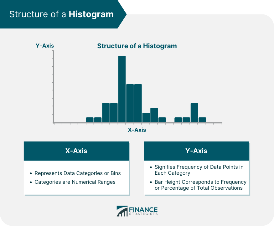
Structure of a Histogram
Horizontal (X-axis)
Vertical (Y-axis)
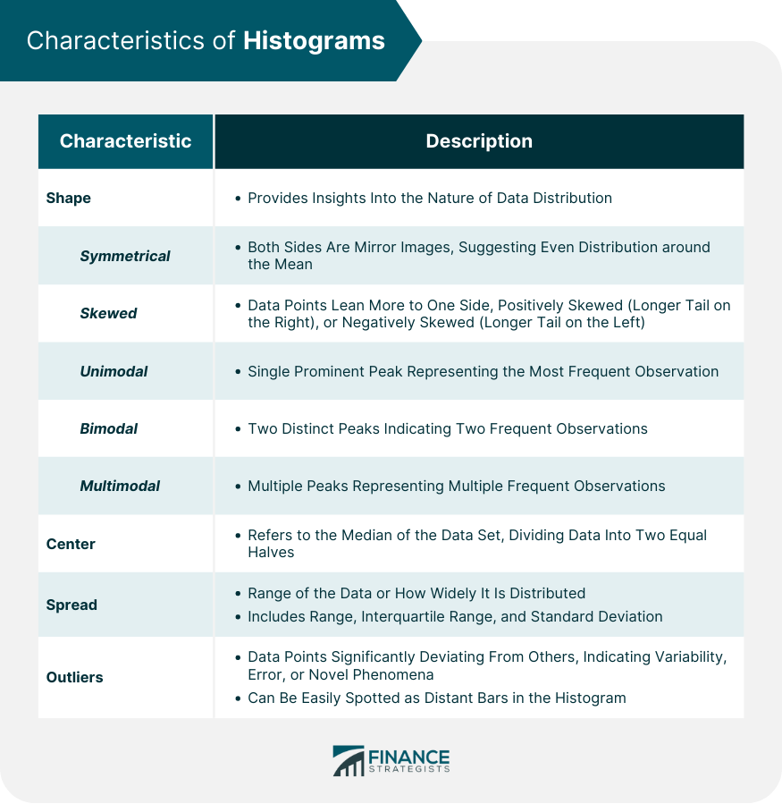
Characteristics of Histograms
Shape
Symmetrical Histograms
Skewed Histograms
Unimodal, Bimodal, and Multimodal

Center
Spread
Outliers
Application of Histograms in Finance
Importance of Histograms in Finance
Examples of Histograms in Financial Data Representation
How to Interpret Histograms
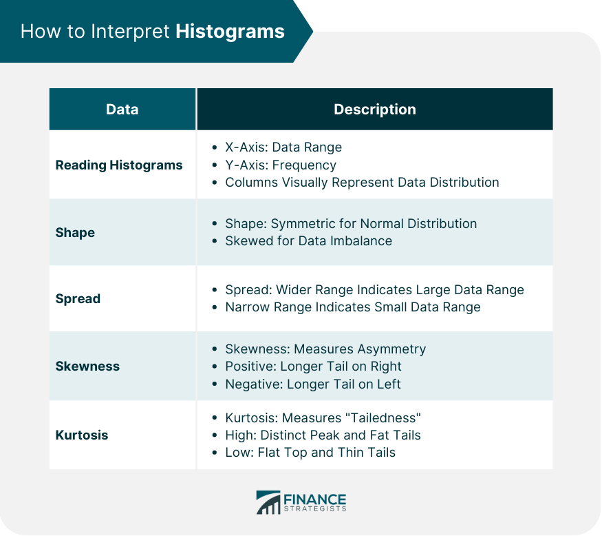
Reading Histograms
Significance of Shape and Spread in Histograms
Identifying Skewness and Kurtosis in Histograms
How to Create a Histogram
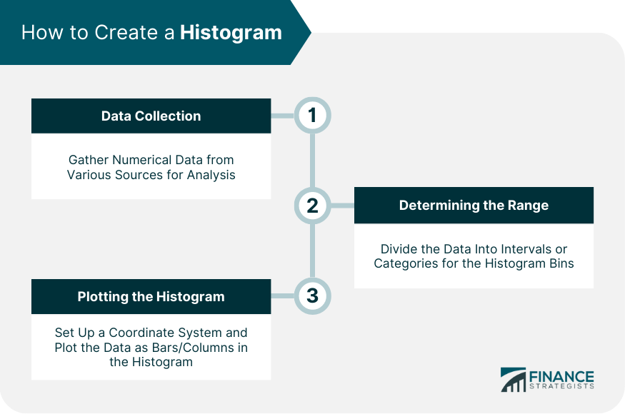
Data Collection
Determining the Range (or Bins)
Plotting the Histogram
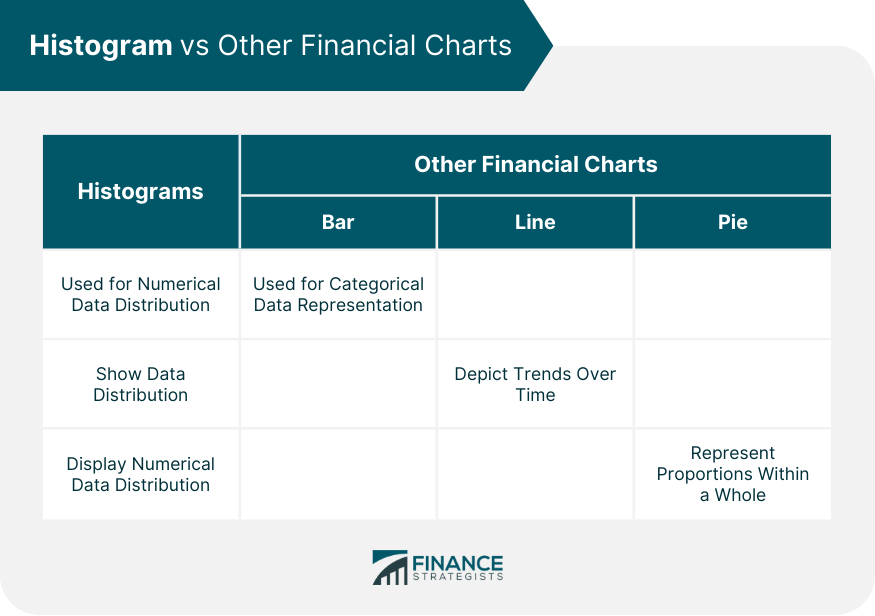
Histogram vs Other Financial Charts
Comparison of Histograms and Bar Charts
Comparison of Histograms and Line Charts
Comparison of Histograms and Pie Charts
Potential Misinterpretations and Pitfalls of Histograms
Final Thoughts
Histograms FAQs
A histogram is a graphical representation of numerical data. It displays the distribution of data by grouping a range of data into bins and the frequency of these bins is represented by bars.
In finance, histograms are used to visualize and interpret large amounts of data. They can help identify patterns, trends, and distribution characteristics in financial datasets.
The MACD (Moving Average Convergence Divergence) histogram is a tool used in trading that provides a graphical representation of the convergence and divergence between the MACD line and the signal line.
To create a histogram, first, collect your data. Next, determine the range or bins for the histogram. Then, plot your data with the ranges on the X-axis and the frequencies on the Y-axis.
Common misinterpretations of histograms often involve skewness and the nature of the data. Understanding the data, context, and appropriate bin sizes can help avoid such misunderstandings.
True Tamplin is a published author, public speaker, CEO of UpDigital, and founder of Finance Strategists.
True is a Certified Educator in Personal Finance (CEPF®), author of The Handy Financial Ratios Guide, a member of the Society for Advancing Business Editing and Writing, contributes to his financial education site, Finance Strategists, and has spoken to various financial communities such as the CFA Institute, as well as university students like his Alma mater, Biola University, where he received a bachelor of science in business and data analytics.
To learn more about True, visit his personal website or view his author profiles on Amazon, Nasdaq and Forbes.