
White candlesticks are integral components of technical analysis in financial trading. They appear on financial charts, representing periods where the closing price of a security was higher than its opening price, symbolizing an upward market sentiment or net buying pressure. Within a specified time frame, white candlesticks capture the security's opening, highest, lowest, and closing prices. These indicators are instrumental for traders and investors in understanding market trends, identifying potential reversals, and formulating trading strategies. Essentially, white candlesticks offer a quick overview of buying and selling activity within a particular period, making them valuable for interpreting market sentiments and forecasting future price movements. A white candlestick comprises two primary parts: the body and the wick (or shadow). The body of the candlestick represents the range between the opening and closing prices of a security during the given time period. If the closing price is higher than the opening price, the candlestick is white (or green or blue, depending on the chart settings). The wick of the candlestick, on the other hand, illustrates the highest and lowest prices reached during the same time period. The top end of the wick marks the high price, while the bottom end marks the low price. While the term 'white candlestick' is frequently used, the actual color of the candlestick can vary based on the settings of the charting software or platform being used. Traditionally, upward or bullish candlesticks were white, while downward or bearish candlesticks were black. However, modern platforms often use green to represent upward movements (akin to white candlesticks) and red for downward movements. The specific colors, while largely a matter of personal preference or convention, do not impact the fundamental information that the candlestick conveys. Candlestick charts are a type of financial chart used to represent price movements of a security, derivative, or currency. These charts are highly prized for their visual appeal and the amount of information they can convey in a compact form. Each candlestick—white, black, or colored—acts as a building block of the overall chart, contributing to the larger picture of market trends, patterns, and sentiments. The appearance of a white candlestick in these charts signals that buyers controlled the price action for that specific time period. A series of white candlesticks can indicate a bullish trend, with the security's price rising over time. The prominence of white candlesticks in technical analysis cannot be overstated. They serve as a fundamental tool for traders in understanding market dynamics, identifying potential trend reversals, and making strategic trading decisions. White candlesticks can act as a visual representation of bullish periods, providing valuable insights into investor sentiment. Their formation can offer a glimpse into the collective mindset of the market, suggesting periods of increasing confidence and buying pressure. Furthermore, specific patterns involving white candlesticks can indicate probable future price movements. For example, a 'bullish engulfing' pattern—formed by a small black (or red) candlestick followed by a larger white candlestick that 'engulfs' the previous day's candlestick—can signal a possible reversal of a downtrend. Such information is invaluable for technical traders who use these insights to plan their trades, set profit targets, and manage risk effectively. Line charts are the simplest form of charts used in financial markets. They offer a single data point—usually the closing price—plotted over a specified time period. By connecting these data points, a line chart provides a clear and straightforward representation of price trends. However, line charts lack the detail necessary for more nuanced analysis, as they omit information about the opening price and the highs and lows within the charted period. Bar charts offer a more detailed view of price action compared to line charts. Each 'bar' in a bar chart represents a specific period and shows four key pieces of information—the opening price, the closing price, the highest price, and the lowest price. This additional information allows traders to understand the price range and volatility during each period. However, bar charts are not as visually engaging or intuitive as their candlestick counterparts. Candlestick charts provide a more enriched view of price action compared to both line and bar charts. Much like bar charts, they depict the opening price, closing price, and the highs and lows for each period. However, their unique format showcases the struggle between buyers and sellers in a visually engaging manner. The white candlestick plays a significant role in candlestick charts. It communicates periods of buying pressure and potential market optimism. When the closing price of a security is higher than its opening price within a specific period, a white candlestick is formed. This is indicative of bullish sentiment, suggesting that buyers controlled the market during that time period. The formation of a white candlestick within a certain time period signifies a bullish sentiment in the market. In other words, the closing price was higher than the opening price, indicating that buying pressure prevailed over selling pressure. Consequently, the market is considered to be in a 'bullish' state. The longer the body of the white candlestick, the more intense the buying pressure, suggesting a stronger bullish sentiment. White candlesticks are pivotal in identifying an uptrend in a market. An uptrend is characterized by higher highs and higher lows in a security's price. This means that the closing prices consistently surpass the opening prices, resulting in the formation of white candlesticks. A series of white candlesticks, especially those with increasing lengths, may indicate a robust uptrend. However, the presence of very long white candlesticks can also suggest over-enthusiasm among buyers and may hint at a potential short-term pullback. While a single white candlestick signifies a period of bullish sentiment, the power of multiple white candlesticks appearing consecutively on a chart should not be underestimated. A series of white candlesticks indicate sustained buying pressure and could be a sign of a strong upward price movement or trend. However, traders should exercise caution and not base their decisions solely on the appearance of one or more white candlesticks. Additional confirmation from other technical indicators or candlestick patterns should be sought to validate the inferred market sentiment. Understanding how to read a white candlestick can provide a trader with invaluable insights into market dynamics. At its core, a white candlestick represents a time period where the close was higher than the open. The bottom of the candlestick body shows the opening price, while the top shows the closing price. The lengths of the wicks illustrate the range of price movement within the specified period, from the lowest to the highest traded prices. Various patterns involving white candlesticks can signal potential market movements. Some of the commonly observed patterns include the 'Bullish Engulfing', 'Three White Soldiers', and 'Morning Star'. The Bullish Engulfing pattern comprises a small bearish (black or red) candlestick followed by a larger bullish (white) candlestick that completely covers or 'engulfs' the body of the previous day's candlestick. This pattern often indicates a potential bullish reversal. The Three White Soldiers pattern involves three consecutive long-bodied white candlesticks with short or nonexistent wicks. Each candlestick opens within the body of the previous candlestick and closes at a new high, signaling a strong uptrend. The Morning Star pattern is a three-candlestick pattern comprising a large bearish candlestick, a small-bodied candlestick (of any color), and a large bullish (white) candlestick. This pattern often suggests a bullish reversal following a downtrend. Red candlesticks are the converse of white candlesticks. A red candlestick signifies a period where the security's closing price was lower than its opening price, indicating a bearish or downward market sentiment. While a white candlestick portrays bullish sentiment and buying pressure, a red candlestick symbolizes bearish sentiment and selling pressure. While white and red are commonly used colors, candlesticks can be depicted in a variety of colors depending on the chart settings. Regardless of the color, what matters is the information the candlestick conveys about the market sentiment—bullish or bearish. Whether it's white or green, it represents buying pressure and bullish sentiment; whether it's black or red, it signifies selling pressure and bearish sentiment. The specific color is secondary to the underlying market dynamics it represents. White candlesticks are crucial in financial markets, visually representing buying pressure and bullish sentiment through a depiction of a security's opening, closing, and highest and lowest prices within a specific time period. They play a key role in illustrating market trends and sentiments on candlestick charts, providing valuable insights into price movements and possible future market behavior. Thus, both novice traders and experienced investors can benefit from understanding their concepts and application to enhance their financial acumen and trading strategies. However, given the complexity of market dynamics, professional wealth management advisors' services are recommended. Their expertise can help decipher market patterns, align investment strategies with financial goals, and aid in making well-informed decisions.What Are White Candlesticks?
Understanding White Candlesticks
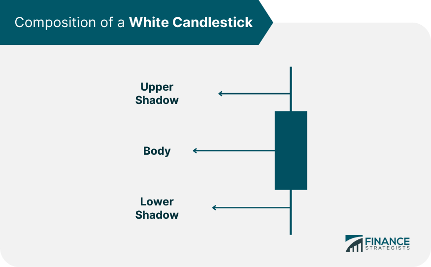
Breaking Down the Composition of a White Candlestick
Variations in Candlestick Color Depiction
Role of White Candlesticks in Candlestick Charts
Function of White Candlesticks in Candlestick Charts
Importance of White Candlesticks in Technical Analysis
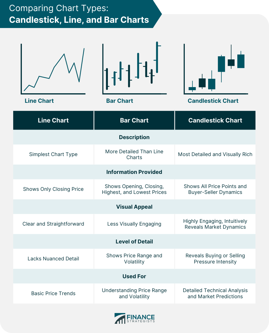
Difference Between Candlestick Charts and Other Charts
Understanding Line Charts: Simplicity and Clarity
Grasping Bar Charts: A Step up in Complexity
Rich Detail of Candlestick Charts
White Candlesticks and Price Movements
Relation of White Candlestick to Bullish Periods
White Candlestick's Indication of an Uptrend
Considerations of Single Versus Multiple White Candlesticks
Interpreting White Candlesticks
Basics of Reading a White Candlestick
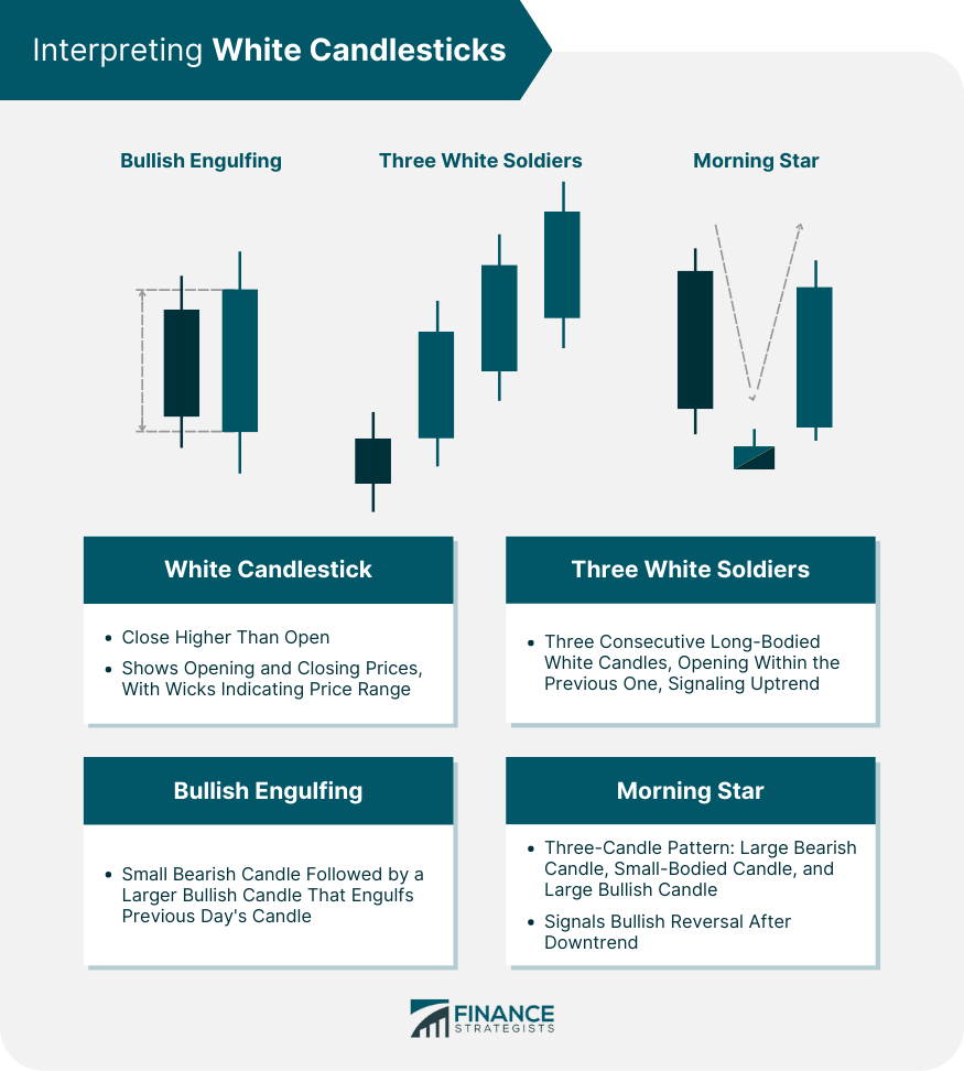
Common Patterns Involving White Candlesticks
Comparison of White Candlesticks With Other Candlesticks
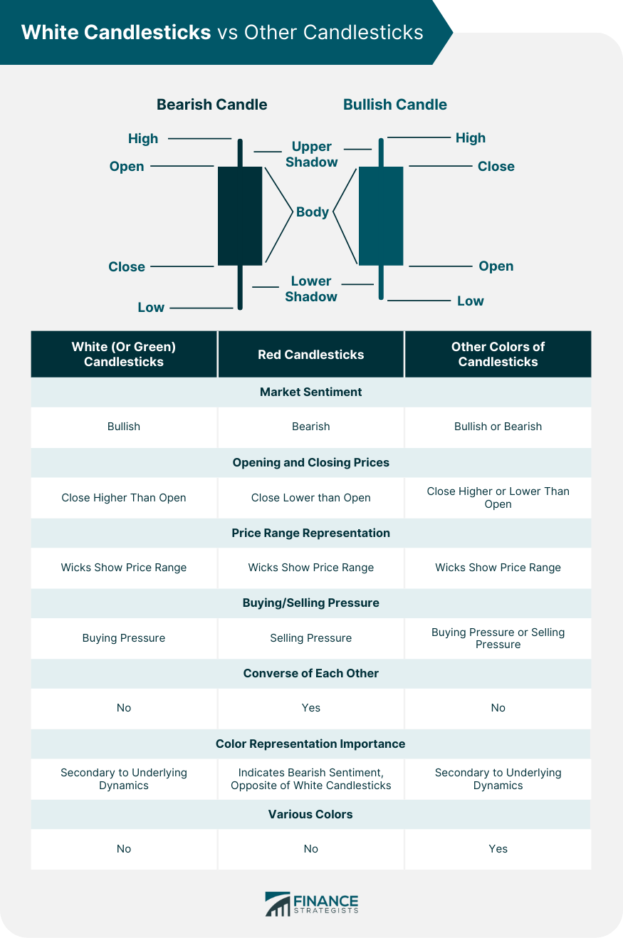
Comparison With Red Candlesticks
Comparison With Other Colors of Candlesticks
Final Thoughts
White Candlesticks FAQs
A white candlestick is a visual representation on a financial chart signifying a time period where the closing price of a security was higher than its opening price, indicating a bullish market sentiment.
A white candlestick comprises a body and wicks. The body represents the range between the opening and closing prices, while the wicks illustrate the highest and lowest prices reached within the given time period.
White candlesticks act as crucial building blocks in a candlestick chart, representing periods of buying pressure or bullish sentiment. Their analysis can provide insights into market trends and potential price movements.
A white candlestick suggests buying pressure in the market. By studying its size, shape, and position relative to other candlesticks, traders can infer market sentiment and predict potential price trends.
The color of a candlestick primarily indicates market sentiment—bullish or bearish. A white (or green) candlestick represents bullish sentiment, while a black (or red) candlestick represents bearish sentiment.
True Tamplin is a published author, public speaker, CEO of UpDigital, and founder of Finance Strategists.
True is a Certified Educator in Personal Finance (CEPF®), author of The Handy Financial Ratios Guide, a member of the Society for Advancing Business Editing and Writing, contributes to his financial education site, Finance Strategists, and has spoken to various financial communities such as the CFA Institute, as well as university students like his Alma mater, Biola University, where he received a bachelor of science in business and data analytics.
To learn more about True, visit his personal website or view his author profiles on Amazon, Nasdaq and Forbes.