A Kagi Chart is a type of chart used in technical analysis to track price movements and make investment decisions. Originating from Japan, Kagi Charts differ from traditional stock charts as they disregard time, focusing solely on price action. This chart type is characterized by vertical lines (representing price) connected by short horizontal lines, which change direction when the price reaches a predetermined amount, known as the reversal amount. Kagi Charts help traders to identify key market signals, including breakouts, consolidations, and trend reversals. This can enable more effective strategic decisions and risk management in trading. These charts also provide unique insights into supply and demand dynamics, adding valuable depth to market analysis. The context of Kagi Charts in modern trading lies in their ability to filter out market noise, focusing solely on significant price movements, thus delivering clarity and simplicity to traders. The thick line, or 'Yang', on a Kagi chart signifies an upward price trend. This line thickens when the price surpasses the previous peak, indicating robust buying pressure. In contrast, the thin line, or 'Yin', symbolizes a downward trend. The line thins out when prices fall below the previous low, indicating strong selling pressure. 'Waists' occur when the Kagi line breaks above a previous high or below a previous low, thereby changing its thickness. 'Shoulders,' on the other hand, form when the line changes direction without a corresponding change in thickness. The interplay of Yang and Yin lines, along with the formation of Shoulders and Waists, paints a vivid picture of the market dynamics. A shift from Yin to Yang may suggest a buy signal, whereas a transition from Yang to Yin can be perceived as a sell signal. Unlike candlestick charts that provide a holistic view of the price action (including open, high, low, and close prices), Kagi charts streamline this data to focus on pivotal price movements. Thus, Kagi charts can offer a more simplified and de-cluttered perspective of market trends. The construction of a Kagi chart begins with selecting an initial base value, which is typically the closing price of a security on a specific date. The next step involves setting a predetermined reversal amount which will signal a change in the Kagi line's direction. This amount can be an absolute number or a percentage, depending on the trader's preference. Starting with a thick line, a vertical line extends upwards with each price increase until the price falls by the predetermined reversal amount, signaling a change in direction. Similarly, a thin line extends downwards with each price decrease until a rise by the reversal amount prompts a directional shift. A change in line direction forms a horizontal line, connecting the last vertical line to the new one. As the Kagi chart evolves, the emergence of Shoulders and Waists aids in visualizing the shifting market dynamics. Interpreting a Kagi chart involves understanding its various elements and their implications. Recognizing the significance of thick and thin lines, along with the transitions and consolidations marked by Shoulders and Waists, can equip traders with valuable insights into the market's mood. The shift from a thin to a thick line indicates increasing buying pressure and might be interpreted as a buy signal. Conversely, a shift from a thick to a thin line represents rising selling pressure, suggesting a potential sell signal. Kagi charts offer clear buy and sell signals. A change from Yin to Yang (thin to thick line) after the price exceeds a previous high is a buy signal. In contrast, a transition from Yang to Yin (thick to thin line) following a price drop below a previous low serves as a sell signal. Horizontal lines on a Kagi chart represent consolidation periods in the market when the price fluctuates within the predetermined reversal amount. These periods can precede significant price movements. Shoulders and waists on a Kagi chart provides critical information about the market's momentum. For instance, multiple waists forming at the same level can indicate strong resistance or support, while repeated shoulder formations may signal a significant reversal looming ahead. Perhaps the most significant advantage of Kagi charts is their ability to filter out 'market noise.' By focusing solely on price movements and disregarding time and volume, these charts present a less cluttered and more straightforward view of market trends. Kagi charts, with their clean and uncomplicated presentation, allow traders to easily identify key price levels and potential reversal points. Their visual simplicity makes them an excellent tool for both beginner and seasoned traders. With their unique construction, Kagi charts emphasize price reversals. This focus can help traders identify significant market turns that other charting methods might miss. One challenge of using Kagi charts is determining the most appropriate reversal amount. An amount set too low might result in excessive sensitivity, leading to frequent direction changes and potentially false signals. Conversely, a high reversal amount may make the chart less responsive to price changes. Like any technical analysis tool, Kagi charts are not immune to false signals. A sudden, drastic price move can cause a rapid shift from Yin to Yang or vice versa, which could potentially lead to false trading signals. While Kagi charts can be powerful, they do not provide information on volume or time. Therefore, they are often best used in conjunction with other technical indicators for a more comprehensive analysis. While both originated in Japan, Kagi charts differ from candlestick charts by focusing exclusively on price action and ignoring time and volume. This leads to a less cluttered chart, allowing traders to identify trends and reversals more clearly. Unlike line charts that plot closing prices over time, Kagi charts switch directions when prices move a predetermined amount, emphasizing price reversals. This unique characteristic makes Kagi charts more effective in identifying critical price levels. Like Kagi charts, point, and figure charts also focus on price action while ignoring time. However, while point and figure charts use a box size and reversal amount to filter out minor price movements, Kagi charts change direction based on a predetermined reversal amount. Renko charts, like Kagi, emphasize price over time. Both use brick or line size as a filter, reducing market noise. However, while Renko charts change direction only when a new brick can be drawn in the opposite direction, Kagi lines change direction whenever the price reverses by the set amount, potentially providing more timely signals. Kagi charts can be used in conjunction with trendlines to visualize better and predict potential price revesals. This combination can provide a clearer perspective on major market trends and highlight significant support and resistance levels. Pairing Kagi charts with moving averages can further smooth out market noise and pinpoint more accurate signals. When the Kagi line crosses a moving average, it may indicate a potential buy or sell signal. While Kagi charts inherently do not account for volume, integrating volume indicators can provide a more comprehensive analysis. Increased volume during a shift from Yin to Yang can strengthen the validity of a buy signal, and similarly, high volume during a shift from Yang to Yin can confirm a sell signal. Kagi Charts, originating from Japan, serve as a potent tool in technical analysis, offering traders unique insights into price movements. Unlike conventional charts, they disregard time and volume, focusing on significant price fluctuations. Their construction includes thick and thin lines, indicating rising and falling prices, and shoulder and waist points, marking significant price reversals. These charts simplify the market analysis, eliminate market noise, and highlight potential buy and sell signals. While they require careful determination of the reversal amount and are subject to potential false signals, their value in visualizing market dynamics is notable. Kagi Charts can also be integrated with other analysis tools, like trendlines, moving averages, and volume indicators, for a comprehensive market outlook. Whether compared to candlesticks, lines, points, figures, or Renko charts, Kagi's emphasis on price action and reversals sets it apart as a distinct, valuable instrument in trading analysis.What Is a Kagi Chart?
Structure and Components of a Kagi Chart
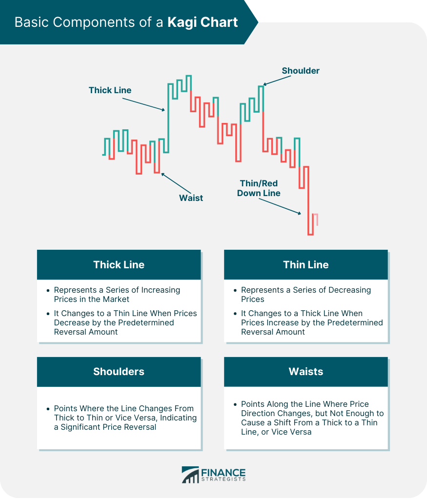
Basic Components
The Thick Line
The Thin Line
Shoulders and Waists
Interpretation of Components
Comparison With Traditional Candlestick Charts
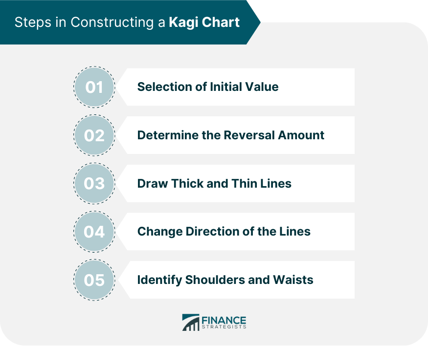
Constructing a Kagi Chart
Selection of Initial Value
Determining the Reversal Amount
Drawing the Chart
Drawing Thick and Thin Lines
Changing Direction of the Lines
Identifying Shoulders and Waists
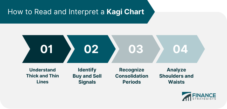
Reading and Interpreting a Kagi Chart
Understanding Thick and Thin Lines
Identifying Buy and Sell Signals
Recognizing Consolidation Periods
Analyzing Shoulders and Waists
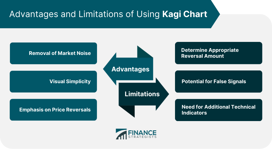
Advantages of Kagi Chart in Financial Analysis
Removal of Market Noise
Visual Simplicity
Emphasis on Price Reversals
Limitations and Challenges of Using Kagi Chart
Determining Appropriate Reversal Amount
Potential for False Signals
Need for Additional Technical Indicators
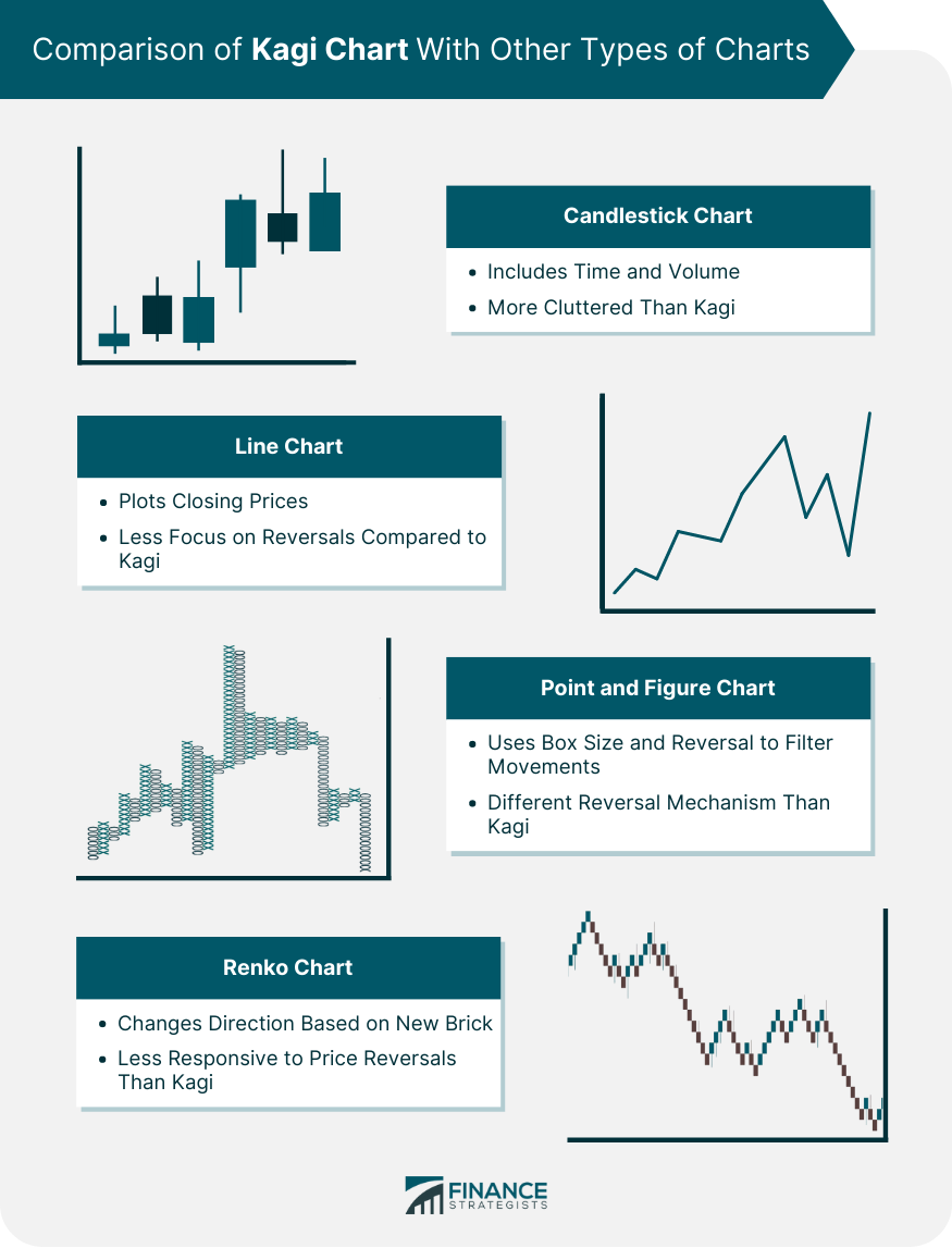
Comparison of Kagi Chart With Other Types of Charts
Kagi Chart vs Candlestick Chart
Kagi Chart vs Line Chart
Kagi Chart vs Point and Figure Chart
Kagi Chart vs Renko Chart
Integrating Kagi Chart With Other Technical Analysis Tools
Combination With Trendlines
Combination With Moving Averages
Combination With Volume Indicators
Final Thoughts
Kagi Chart FAQs
Kagi charts are a type of technical analysis tool that originated in Japan. They focus solely on price movements, ignoring time and volume, which helps to filter out 'market noise.' Kagi charts are characterized by a series of vertical lines (thick and thin) that change direction when the price reverses by a predetermined amount.
Unlike traditional line or candlestick charts, Kagi charts do not take time or volume into account. They only change direction when the price moves by a pre-set amount, thereby placing emphasis on significant price reversals. This focus on price action can provide a clear view of market trends and potential reversal points.
In Kagi charts, a change from a thin line to a thick line indicates a shift from selling pressure to buying pressure, suggesting a potential buy signal. Conversely, a shift from a thick line to a thin line indicates an increase in selling pressure, suggesting a possible sell signal.
The main challenges of using Kagi charts include determining an appropriate reversal amount, the potential for false signals due to sudden price changes, and the need to combine Kagi charts with other technical indicators for a comprehensive analysis due to their disregard for volume and time.
Yes, Kagi charts can be combined with other technical indicators like trendlines, moving averages, and volume indicators. This integration can provide a more comprehensive market analysis, allowing traders to identify more accurate trading signals.
True Tamplin is a published author, public speaker, CEO of UpDigital, and founder of Finance Strategists.
True is a Certified Educator in Personal Finance (CEPF®), author of The Handy Financial Ratios Guide, a member of the Society for Advancing Business Editing and Writing, contributes to his financial education site, Finance Strategists, and has spoken to various financial communities such as the CFA Institute, as well as university students like his Alma mater, Biola University, where he received a bachelor of science in business and data analytics.
To learn more about True, visit his personal website or view his author profiles on Amazon, Nasdaq and Forbes.