The yield curve is a graphical depiction of the different interest rates paid by bonds with the same level of risk but yields to maturity. Typically, when people talk about a yield curve, they are referring to the difference in interest rates paid between three months to thirty years. The graph shows the investor their possible earnings based on the money they lend for a given period. The y-axis of the graph represents the interest rate, and the x-axis shows the time to maturity. The Treasury yield curve is a graphical depiction of the different interest rates (yields) paid on government bonds of various durations to maturity. It is typically represented in a graph comparing yields from 3-month to 30-year using data from the U.S. Federal Reserve. The Y-axis of the graph represents the interest rate (yield %), and the X-axis shows the time to maturity. There are three key types of yield curve profiles: For example: 3-year notes pay 0.2%, while 5-year notes pay 0.5%, and 30-year notes pay 3%. The yield curve generally steepens as short-term rates drop well below long-term and longer-term yields are increasing. This often indicates a growing economy and rising investment risk tolerance otherwise referred to as a ‘risk-on’ environment (i.e. investors are increasing riskier stock purchases.) Figure 1 – A chart showing the inverted Treasury Yield Curve on June 3, 2019. The Y-axis represents the interest rate (Yield %), and the X-axis, the time to maturity. Data – US Federal Reserve. However, the yield curve is a single indicator and is only an expectation of what may occur and like most indicators, works better when confirmed by other economic indicators. Figure 2 – US 10 Treasury minus 3 month yields. Grey vertical bars indicate recessions. The graph drops below zero when 10 Year rates drop below 3 month (red boxes). Chart courtesy of https://fred.stlouisfed.org/ In 1986, Campbell Harvey revealed an economic indicator as part of his PhD dissertation, which at the time had boasted a perfect accuracy rate in predicting recessions since 1962. On March 22, 2019 the daily 10-year Treasury yield first dropped below the 3-month Treasury yield rate and stayed there for five days. On May 15, the rates again inverted and remained negative for all but five trading days until October 11 or a little more than one-quarter. Campbell Harvey, now Professor of Finance at Duke University's Fuqua School of Business, saw his indicator’s most recent warning signal confirmed when a recession was officially declared by the National Bureau of Economic Research in June 2020 as having started on February 3. In other words, his indicator has maintained its 100% accuracy rate as a recession warning tool. It is interesting to note that the longer the 10-year – 3 month Treasury yield curve remains inverted the longer the subsequent recession. For example, the yield curve inversion prior to the 2007-9 recession which lasted for 18 months, remained inverted for 10 months between July 2006 and May 2007. In the prior recession of 2001 which lasted seven months, the yield curve remained inverted for six months. It is also important to point out that the NBER can take anywhere from a few months to a year or more to confirm a recession call. For example, it declared the 2020 recession to have begun just four months after the fact. The 2007-9 recession that began in June 2009, wasn’t called by the NBER until September 20, 2010 or nearly 16 months after the fact. References:Bond Yield Curve
What Is The Yield Curve – Is It a Useful Investment Tool?
When the yield curve takes on an inverted shape, it warns of economic weakness. It often signals a recession as investors reduce risk, are less interested in stocks and more interested in bonds. This signifies a ‘flight to safety’ or ‘risk-off’ investment environment. (See Pro Tips below).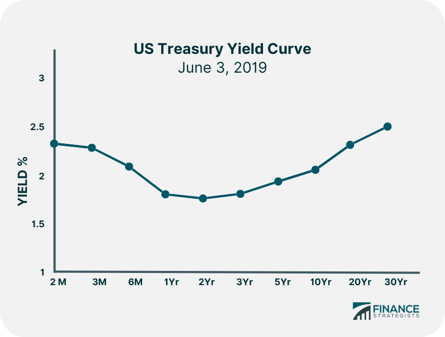
The steeper the slope of the curve the greater the expectation of an interest rate change. A steepening yield curve shows rising investor risk tolerance or ‘risk-on’ behavior. Pro Tip
This indicator generates a recession warning when the 10-Year US Treasury yield drops below the Treasury 3-month yield and stays negative (inverted) for at least one quarter.
In other words, by the time a recession becomes official, much of the damage to a stock portfolio may have already been done!
Yield Curve FAQs
The yield curve is a graphical depiction of the different interest rates paid by bonds with the same level of risk but yields to maturity (interest rates).
Typically, when people talk about a yield curve, they are referring to the difference in interest rates paid between three months to thirty years.
The graph shows the investor their possible earnings based on the money they lend for a given period.
The three types of yield curves are normal, inverted, and flat.
In 1986, Campbell Harvey revealed an economic indicator as part of his PhD dissertation, which at the time had boasted a perfect accuracy rate in predicting recessions since 1962. His indicator has maintained its 100% accuracy rate as a recession warning tool.
True Tamplin is a published author, public speaker, CEO of UpDigital, and founder of Finance Strategists.
True is a Certified Educator in Personal Finance (CEPF®), author of The Handy Financial Ratios Guide, a member of the Society for Advancing Business Editing and Writing, contributes to his financial education site, Finance Strategists, and has spoken to various financial communities such as the CFA Institute, as well as university students like his Alma mater, Biola University, where he received a bachelor of science in business and data analytics.
To learn more about True, visit his personal website or view his author profiles on Amazon, Nasdaq and Forbes.